
In an era of value-based medicine, data-driven quality improvement is more important than ever to ensure safe and efficient imaging services. Familiarity with high-value tools enables all radiologists to successfully engage in quality and efficiency improvement. In this article, we review the model for improvement, strategies for measurement, and common practical tools with real-life examples that include Run chart, Control chart (Shewhart chart), Fishbone (Cause-and-Effect or Ishikawa) diagram, Pareto chart, 5 Whys, and Root Cause Analysis.
Introduction
In Radiology, quality improvement is the constant effort to improve performance, safety, and patient outcomes based on imaging services . Diagnostic imaging and image-guided procedures require a complex system of information, equipment, personnel, and decision-making that must be well integrated to provide patient care effectively and safely. Appropriate intervention at points of inefficiency or potential hazard can reduce costs and benefit patient care. Involving departmental and hospital leadership is essential to establish an organizational commitment to support these activities . Understanding the model for improvement, strategies for measurement, and practical quality improvement tools enables every radiologist to successfully engage in quality and efficiency improvement.
The Model for Improvement
Quality improvement is most effective when it is systematic, data-driven, continuous, and incorporated as a core responsibility of health-care professionals. It should employ a formal methodology and focus on system change. In contrast, informal improvement efforts are frequently sporadic, anecdotal, rarely data-driven, and implemented without an assigned responsible supervisor. Such patchwork improvements are challenging to integrate into a cohesive system and may lead to future inefficiencies, not initially anticipated.
The “Model for Improvement,” as outlined by the Institute of Healthcare Improvement, emphasizes project aims, designing measurements around the aims, and then testing small changes before enterprise-wide implementation. The process is then continued in a cycle of Plan-Do-Study-Act (PDSA) ( Table 1 ) .
TABLE 1
The Model for Improvement Specifies Aims, followed by Measurements Needed to Track Progress Toward the Specified Aims, and then Specific Ideas That Will Enable Us to Accomplish Our Aims
Aims What are we trying to accomplish?
- State clear objectives—know exactly what you are trying to do
Measurements How will we know that a change is an improvement?
- Measure processes and outcomes
Change ideas What change can we make that will result in improvement?
Get Radiology Tree app to read full this article<
Get Radiology Tree app to read full this article<
Get Radiology Tree app to read full this article<
Lean Management and Six Sigma
Get Radiology Tree app to read full this article<
Get Radiology Tree app to read full this article<
Aim
Get Radiology Tree app to read full this article<
Measurement
Get Radiology Tree app to read full this article<
Get Radiology Tree app to read full this article<
Get Radiology Tree app to read full this article<
Get Radiology Tree app to read full this article<
Get Radiology Tree app to read full this article<
TABLE 2
Types of Measures, Relation to Aims, and Our Health Example
Aims Clear objectives
Outcome measures Assess progress toward the ultimate aim
Progress measures Learning during PDSA cycles
Balance measures Assess system improvement
Get Radiology Tree app to read full this article<
Get Radiology Tree app to read full this article<
Get Radiology Tree app to read full this article<
Get Radiology Tree app to read full this article<
Get Radiology Tree app to read full this article<
TABLE 3
Measurement for Improvement Versus Measurement for Clinical Research
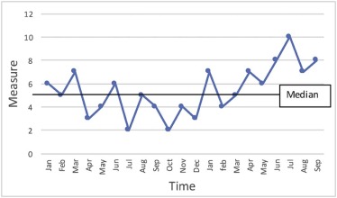
Improvement Clinical research Aim Better process, system, outcomes New generalizable knowledge Observability Test observable Test blinded Bias Accept consistent bias Design to eliminate bias Sample size “Just enough” data “Just in case” data Hypothesis flexibility Changes as learning takes place Fixed hypothesis Testing strategy Small sequential tests One large test Data analysis Run chart or control chart Hypothesis tests ( t tests, etc)
Get Radiology Tree app to read full this article<
Data Presentation
Get Radiology Tree app to read full this article<
Specific Quality and Efficiency Improvement Tools
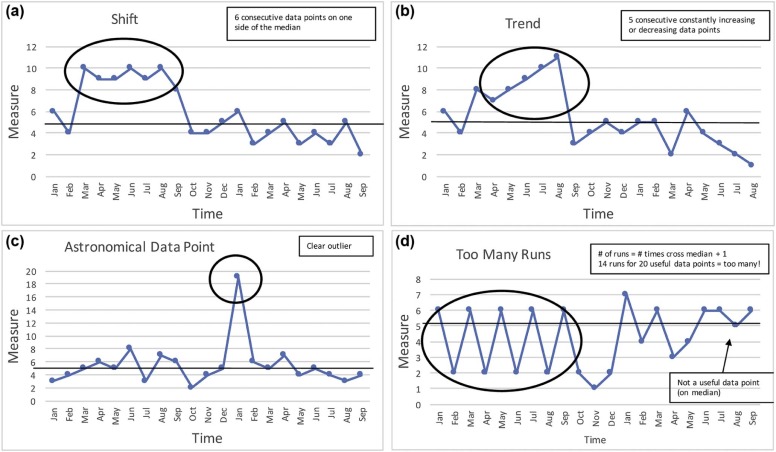
Run Chart
Get Radiology Tree app to read full this article<
Get Radiology Tree app to read full this article<
Get Radiology Tree app to read full this article<
When it Is Most Useful
Get Radiology Tree app to read full this article<
Get Radiology Tree app to read full this article<
Get Radiology Tree app to read full this article<
Get Radiology Tree app to read full this article<
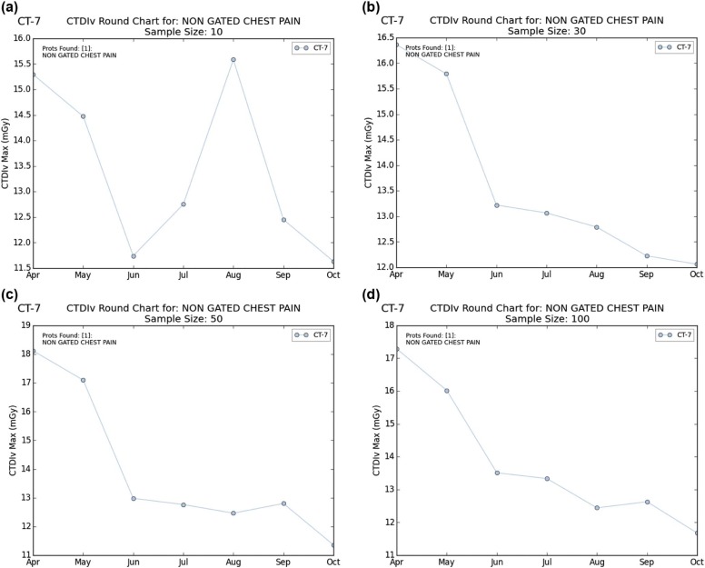
![Figure 4, Measuring impact in our department. Data pre or post intervention can be directly compared to assess for change. In this case, an intervention aimed at reducing radiation exposure during chest computed tomography angiography examinations (scanner settings modified based on patient body mass index [BMI]) was implemented in May. The subsequent continuously decreasing 5 data points indicate a trend implying that nonrandom change from the initial baseline has been achieved.](https://storage.googleapis.com/dl.dentistrykey.com/clinical/QualityandEfficiencyImprovementToolsforEveryRadiologist/3_1s20S1076633218300722.jpg)
Get Radiology Tree app to read full this article<
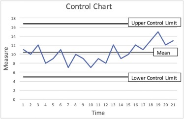
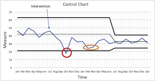
Control Chart (Shewhart Chart)
Get Radiology Tree app to read full this article<
Get Radiology Tree app to read full this article<
Get Radiology Tree app to read full this article<
When it Is Most Useful
Get Radiology Tree app to read full this article<
Get Radiology Tree app to read full this article<
Get Radiology Tree app to read full this article<
Get Radiology Tree app to read full this article<
Get Radiology Tree app to read full this article<
Choosing a Run Chart or Control Chart
Get Radiology Tree app to read full this article<
Get Radiology Tree app to read full this article<
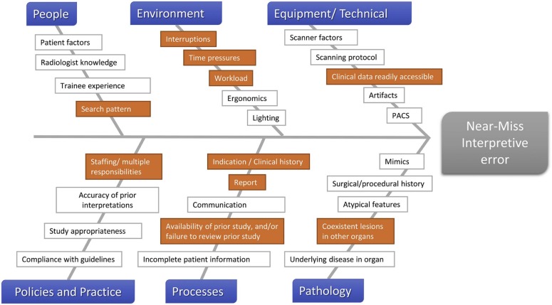
Fishbone (Cause-and-Effect or Ishikawa) Diagram
Get Radiology Tree app to read full this article<
Get Radiology Tree app to read full this article<
When it Is Most Useful
Get Radiology Tree app to read full this article<
Example
Get Radiology Tree app to read full this article<
Get Radiology Tree app to read full this article<
Get Radiology Tree app to read full this article<
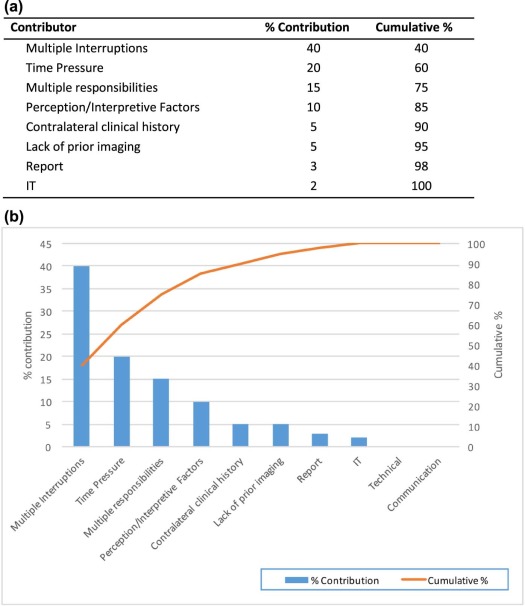
Pareto Chart
Get Radiology Tree app to read full this article<
Get Radiology Tree app to read full this article<
When it Is Most Useful
Get Radiology Tree app to read full this article<
Five Whys
Get Radiology Tree app to read full this article<
Get Radiology Tree app to read full this article<
When it Is Most Useful
Get Radiology Tree app to read full this article<
Example
Get Radiology Tree app to read full this article<
Get Radiology Tree app to read full this article<
Get Radiology Tree app to read full this article<
Root Cause Analysis
Get Radiology Tree app to read full this article<
Get Radiology Tree app to read full this article<
Get Radiology Tree app to read full this article<
Get Radiology Tree app to read full this article<
When it Is Most Useful
Get Radiology Tree app to read full this article<
Example
Get Radiology Tree app to read full this article<
Get Radiology Tree app to read full this article<
An Integrated Approach
Get Radiology Tree app to read full this article<
Get Radiology Tree app to read full this article<
Get Radiology Tree app to read full this article<
Get Radiology Tree app to read full this article<
Conclusions
Get Radiology Tree app to read full this article<
Acknowledgment
Get Radiology Tree app to read full this article<
Get Radiology Tree app to read full this article<
References
1. Abujudeh H.H., Kaewlai R., Asfaw B.A., et. al.: Quality initiatives: Key performance indicators for measuring and improving radiology department performance. Radiographics 2010; 30: pp. 571-580.
2. Kruskal J.B., Anderson S., Yam C.S., et. al.: Strategies for establishing a comprehensive quality and performance improvement program in a radiology department. Radiographics 2009; 29: pp. 315-329.
3. Kruskal J.B., Eisenberg R., Sosna J., et. al.: Quality initiatives: quality improvement in radiology: basic principles and tools required to achieve success. Radiographics 2011; 31: pp. 1499-1509.
4. Dekker S.: The Field Guide to Understanding Human Error. Hampshire.2006.Ashgate Publishing LimitedEngland
5. Murray S., Provost L.P.: The Health Care Data Guide: Learning from Data for Improvement.2011.Jossey-BassSan Francisco, CA
6. Kruskal J.B., Reedy A., Pascal L., et. al.: Quality initiatives: lean approach to improving performance and efficiency in a radiology department. Radiographics 2012; 32: pp. 573-587.
7. Kelly A.M., Cronin P.: Practical approaches to quality improvement for radiologists. Radiographics 2015; 35: pp. 1630-1642.
8. Perla R.J., Provost L.P., Murray S.K.: The run chart: a simple analytical tool for learning from variation in healthcare processes. BMJ Qual Saf 2011; 20: pp. 46-51.
9. Health Quality Ontario : Measurement: Interpreting Run Charts. Available at http://qualitycompass.hqontario.ca/Documents/EN/Interpreting%20Run%20Charts.pdf
10. Institute for HealthCare Improvement : Science of Improvement: Establishing Measures. Available at http://www.ihi.org/resources/Pages/HowtoImprove/ScienceofImprovementEstablishingMeasures.aspx
11. Tague N., American Society for Quality: The quality toolbox.2005.Quality PressMilwaukee, WI
12. Mohammed M.A., Worthington P., Woodall W.H.: Plotting basic control charts: tutorial notes for healthcare practitioners. Qual Saf Health Care 2008; 17: pp. 137-145.
13. Institute for HealthCare Improvement : The Science of Improvement on a Whiteboard!. Available at http://www.ihi.org/education/IHIOpenSchool/resources/Pages/BobLloydWhiteboard.aspx
14. Langley G.L., Nolan K.M., Nolan T.W., et. al.: The Improvement Guide: A Practical Approach to Enhancing Organizational Performance.1996.Jossey-BassSan Francisco, CA
15. Stecker M.S.: Root cause analysis. J Vasc Interv Radiol 2007; 18: pp. 5-8.
16. Brook O.R., Kruskal J.B., Eisenberg R.L., et. al.: Root cause analysis: learning from adverse safety events. Radiographics 2015; 35: pp. 1655-1667.
17. Kruskal J.B., Siewert B., Anderson S.W., et. al.: Managing an acute adverse event in a radiology department. Radiographics 2008; 28: pp. 1237-1250.
18. van Noord I., Eikens M.P., Hamersma A.M., et. al.: Application of root cause analysis on malpractice claim files related to diagnostic failures. Qual Saf Health Care 2010; 19: pp. e21.
19. Reason J.: The contribution of latent human failures to the breakdown of complex systems. Philos Trans R Soc Lond B Biol Sci 1990; 327: pp. 475-484.
20. Siewert B., Kruskal J.B., Eisenberg R., et. al.: Quality initiatives: quality improvement grand rounds at Beth Israel Deaconess Medical Center: CT colonography performance review after an adverse event. Radiographics 2010; 30: pp. 23-31.
21. Wu A.W.: Medical error: the second victim. The doctor who makes the mistake needs help too. BMJ 2000; 320: pp. 726-727.
22. Marx D.: Patient safety and the “just culture”: a primer for health care executives.2001.Columbia UniversityNew York, NY
23. The Joint Commission : Sentinel Event Policy. Available at http://www.jointcommission.org/assets/1/18/Sentinel_Event_Policy_3_2011.pdf
24. The Joint Commission : Framework for Conducting a Root Cause Analysis and Action Plan. Available at http://www.jointcommission.org/Framework_for_Conducting_a_Root_Cause_Analysis_and_Action_Plan/